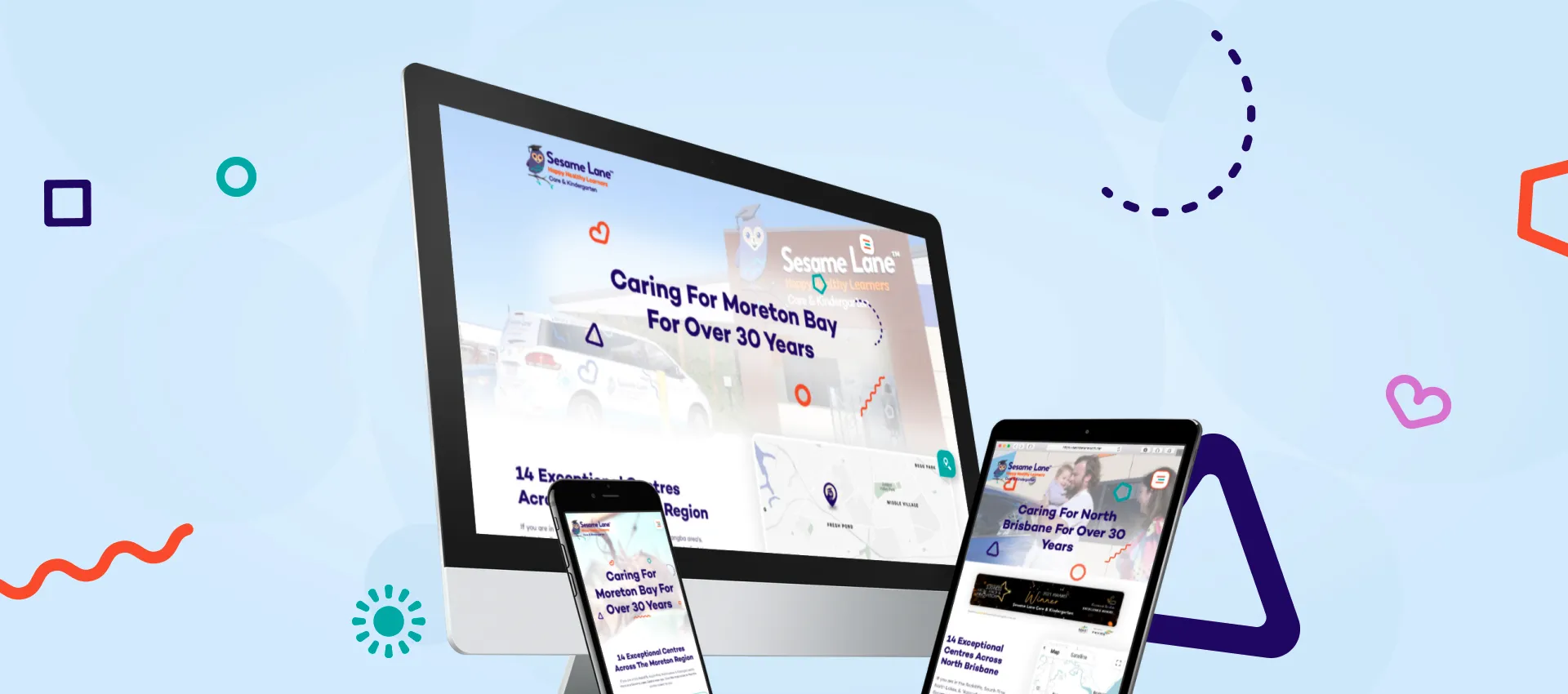
Our aim was to enhance the user experience in order to maximise value from every website visitor. Emphasis needed to be given to the individual centres so that they told their own story, as well as being directly visible in a Google search for childcare centres in their location. We were to also research key competitors on what they were doing well.
Project Brief
Client
Sesame Lane
Scope
- Custom designed and built web platform.
- All pages designed specific to client requirements.
- Header video shot by BZ.
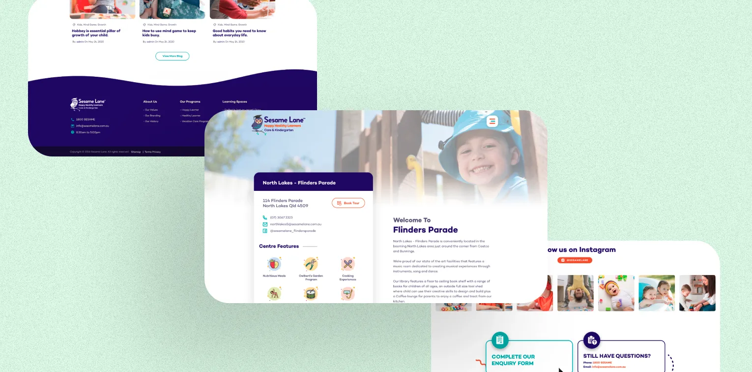
- Dedicated content rich location pages for top rankings on Google.
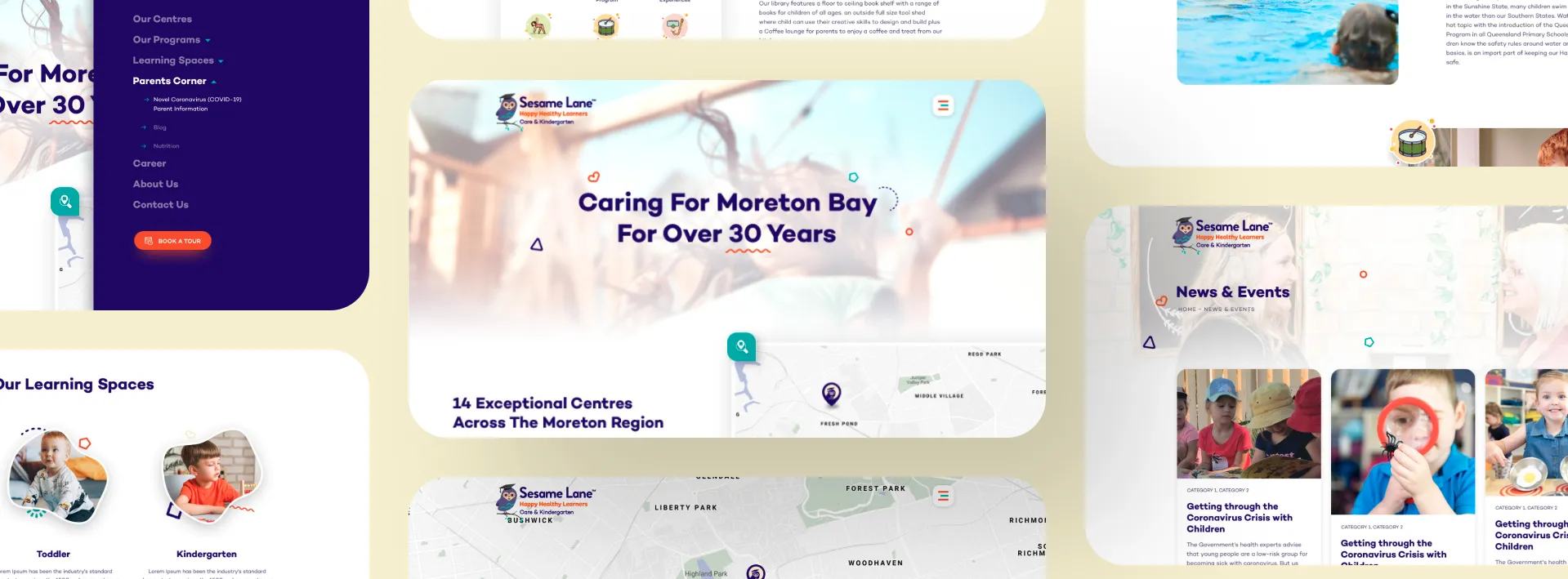
- Subtle animations specifically built for user experience, using client brand elements.
- WordPress back-end custom built for management by internal marketing teams.
Services
- Branding
- UX/UI Design
- Technology
The Challenge
Sesame Lane had a website built on a custom platform which was ‘proprietary’ to the agency that delivered their website. This meant they had very limited access to self-manage and ultimately cost them for every small update they wanted to make.
Additionally, the website design lacked user journey elements and was more like a brochure rather a design that delivered a compelling user experience. In a competitive environment such as childcare, conversion rates must be maximised as new enrolments are a constant requirement.
The Solution
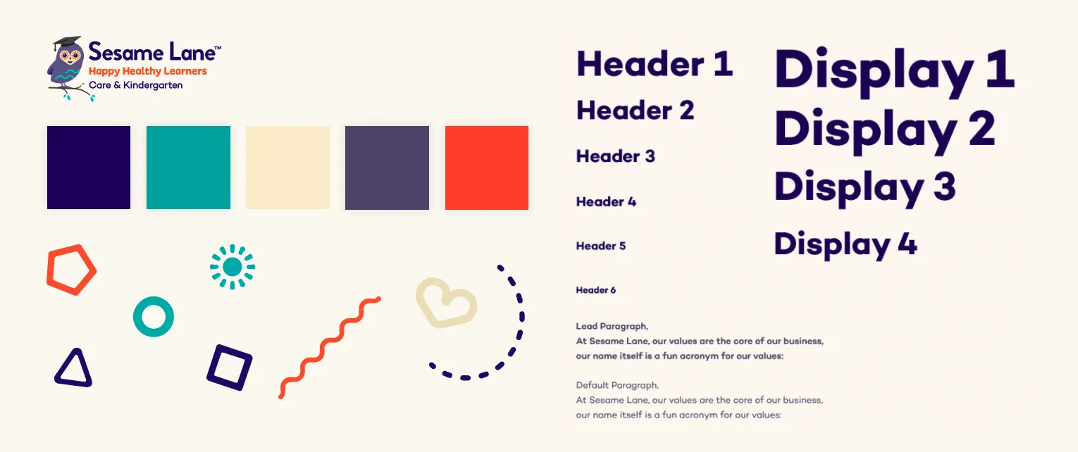
Sesame Lane had not long refreshed their branding so there was a very complete brand style kit available for our utilisation. We used their brand shapes and created subtle animations that create small movements throughout the pages to attract the user’s eyes to important page elements.
Our SEO team conducted thorough research on local competitors to understand what search terms were driving meaningful traffic to their respective websites.
Our creative team designed page templates specifically for Sesame Lane staff to easily copy as required- in particular centre pages, and templates for marketing campaigns.
Each centre now has a dedicated page which ranks on Google searches for their locations.
Strong call-to-actions placed throughout the website to drive further engagement and conversions to Book-A-Tour instantly on the website for the user’s desired centre location.
WordPress was used as the content management system as it is open source and easy for marketing teams to self-manage updates and new content additions.
Outcomes
The client has the capability to manage their website which has saved them thousands of $$$ in agency fee’s. BZ is engaged for significant new bodies of work rather than easy amendments and updates.
The centre location pages are contributing to website traffic stats as the SEO strategy implemented has the pages ranking independently in Google search and delivering unique website entrances.
Tout bookings have improved markedly with a dramatically improved user journey and experience.
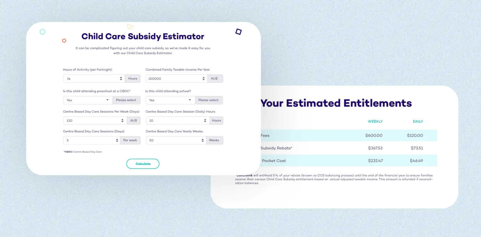
BZ have since implemented a CCS calculator styled specifically to the website theme, which has proven to be a handy tool for staff to engage prospective families.
78%
INCREASE IN ORGANIC TRAFFIC
25%
REDUCTION IN BOUNCE RATE
1500+
CONVERSIONS

